I’m not sure how we’d fix that except by doing something extremely intrusive — maybe a dark background pill shape with the unread count inside it. But that would look super weird.
This is really a drawback of Liquid Glass. What I’ve done is to turn on tinted Liquid Glass (instead of clear) and to turn on Reduce Transparency. These two settings help a ton with issues like this!
Proposal: Match the font type/size of the folder/rss source name, but always keep it visible, if the naming is too long and keep it in the same alignment.
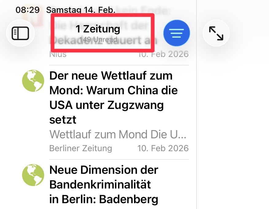
As you can see “1 Zeitung” is very readable…
I know you’re not a fan of exzessive settings options (your last talk w JGruber), but this could maybe an option: Show / Hide Unread Count
If someone wants to see it, it will be shown w/o any issues, if not then not …
Finally: a feature that does not work should then be eliminated or better: improved to be helpful.
I agree this is less than optimal and the LQ effects often get in the way of using a device. I’ve also switched Liquid Glass to tinted mode. And I also agree with @brent and @Frizlab that NNW shouldn’t (have to) fix this. Its an OS-level issue and Apple needs to get a handle on it.
I think Product Feedback - Apple is where this needs to go, and if you have access to it, use the Feedback App Apple provides to beta testers and send them a screenshot of the issue in as many apps as possible (NNW is not the only one).