Toolbar anomalies

I’m not sure I’m a fan of the new folder / feed placement and button:

I’m even less enthralled by its position. I think I’d prefer it on the toolbar as two separte buttons, but that is preference:

(somewhere on here).

This is not a big deal and I’ll live and love NNW regardless, but I thought I’d chime in and see what others feel.

Again, many thanks for a wonderful app over the years (I’ve been using it in some form or another for well over 20 years).

Is this on Mac, iPad, or iPhone? (It can be hard to tell from screenshots these days.)

1 Like

I see the same thing on macOS 26.2.

Apologies. macOS Tahoe

Definitely odd. The default placement for this is the right-most item above the sidebar, as in this screenshot:

You can also see in the customize-toolbar sheet what the defaults are:

I’m guessing you must have customized your toolbar, and there’s not enough room for that icon so it’s using a chevron and a menu.

If you customize your toolbar, can you put that item back where it goes? And does it stay there? Or is something going on that I just haven’t seen yet on my computer?

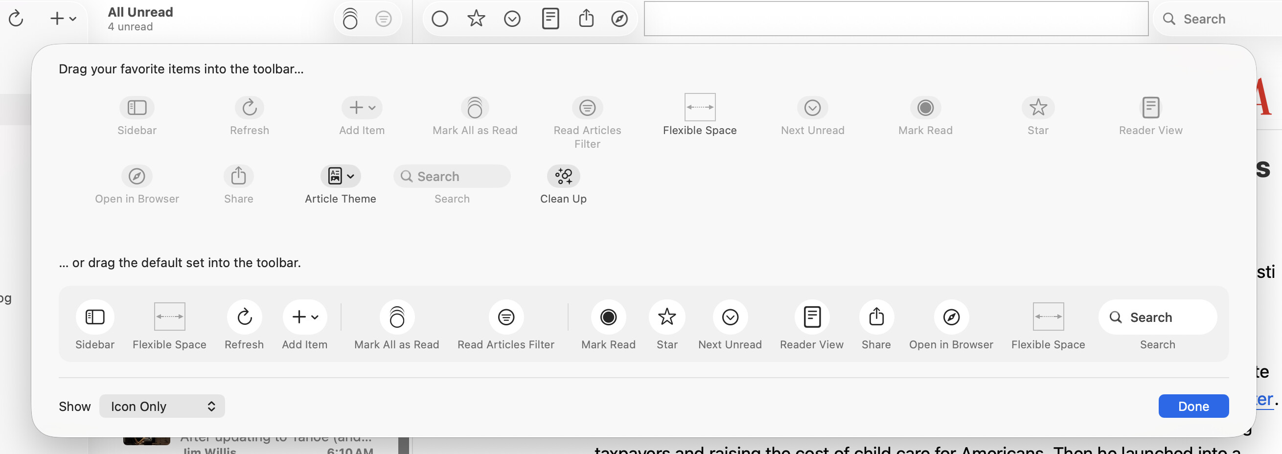
After a little messing around, I have got the toolbar to comply and is now pretty much like your screenshot Brent.

I hadn’t customised the toolbar, so I don’t know why it behaved that way. Whilst now customising to get the + icon back to the left next to refresh, it actually pushed the refresh button to the right under the double chevron (changing places with the “new” button).

I wondered if resizing the window (which was already quite wide on a Studio Display) would trigger something, but no, it did nothing regardless of the width of the window (also tried adjusting height - in for a penny etc). What seems to have triggered a ‘correct’ redraw was punting the app into full screen mode (green button) then back into windowed. I have absolutely no idea if it was indeed this, but I thought it useful to mention what I did and how it got back to being ‘normal’ and persistent after restartign the app.

If you need anything else, let me know. More than happy to help.

FYI: I changed the title of the post to reflect the reality for future reference

I will have a look at this. I think it may just be a case of giving the sidebar a larger minimum width.

1 Like

It’s a two line fix if we want to make it:


sidebarViewController!.view.translatesAutoresizingMaskIntoConstraints = false
sidebarViewController!.view.widthAnchor.constraint(greaterThanOrEqualToConstant: 260).isActive = true

This would constrain the sidebar to this minimum size—excluding when it is collapsed—and prevent the buttons from hiding.

1 Like

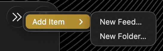
Just for clarification, in my case, the + button didn’t just disappear, it added another double chevron button (>>) to the extreme right of the application window next to the search box which had collapsed into a search button:

(for reference)

See the difference pre & post:

Pre

Post

1 Like

The post behaviour looks more logical and expected to me.

Anyone else?

@stuartbreckenridge Would you do a PR with that fix?

b4 seems to have fixed the toolbar too (post behaviour - see above). Awesome.

Thank you.