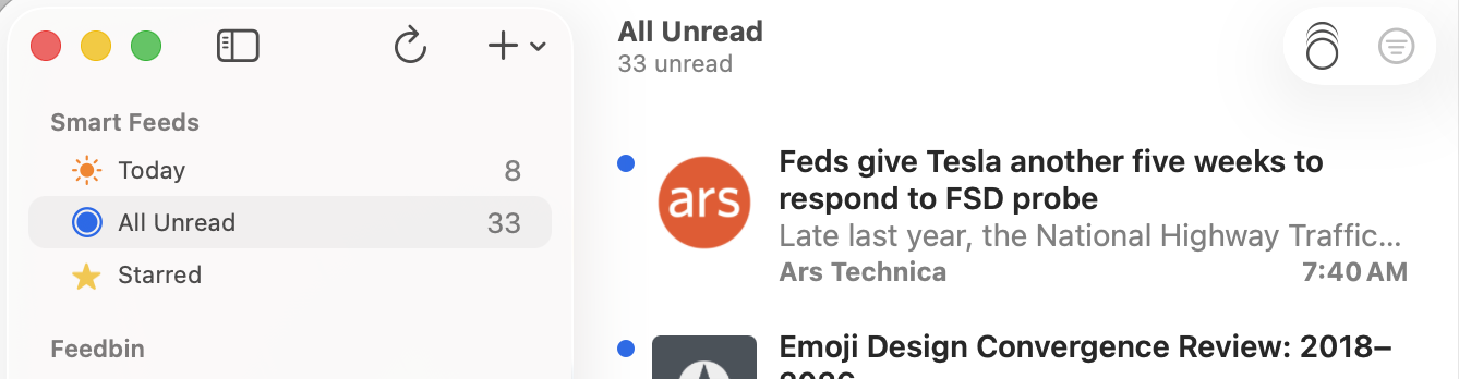
I updated from beta 3 to beta 4 and the sidebar grew in width by about an inch. There is now a ton of white space and it shrunk the width of the article list. I can make that wider but then it makes the content window smaller. This seems like a regression?
In b4 a minimum width of 260 was applied so that the sidebar’s toolbar buttons don’t collapse into a >> button on the far right of the app.

Is this solving a problem by creating another problem? It grew A TON compared to previous versions, and really shrinks the content window. It’s just a sea of whitespace now ![]()
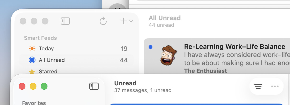
Here also is a screen shot showing the new width of the NNW 7.0b4 sidebar compared to Mail’s sidebar (which itself is too wide). The new width is… just too wide.
It can probably be trimmed down a bit.
It has been super-reduced (by almost 10%) in the latest commit. Anything less than this—which you can still force the app to do if you resize the window—will start moving the add button and refresh button to the >> button on the right-hand side.
Time is short for me today, but I will try to get a Mac beta released later today with this change. If not today then tomorrow.
Great, thanks for the quick turnaround!
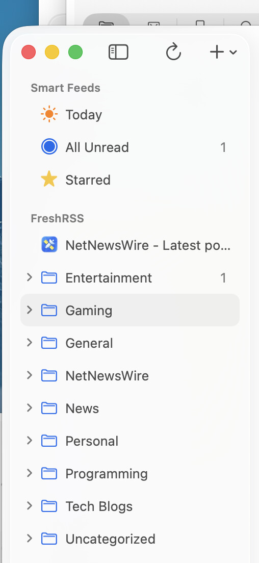
Tested this today on build 7011, works great? It’s actually resizable to small enough to move the “add item” to the right – which I actually like. I don’t use that item much, and I’d prefer the trade-off to make the column right-sized for my screen, with the proviso that too small moves it right (and the UI makes this pretty obvious when it happens).
I was hoping the trade-off would be worth it for the folks who like a narrow sidebar. Cool