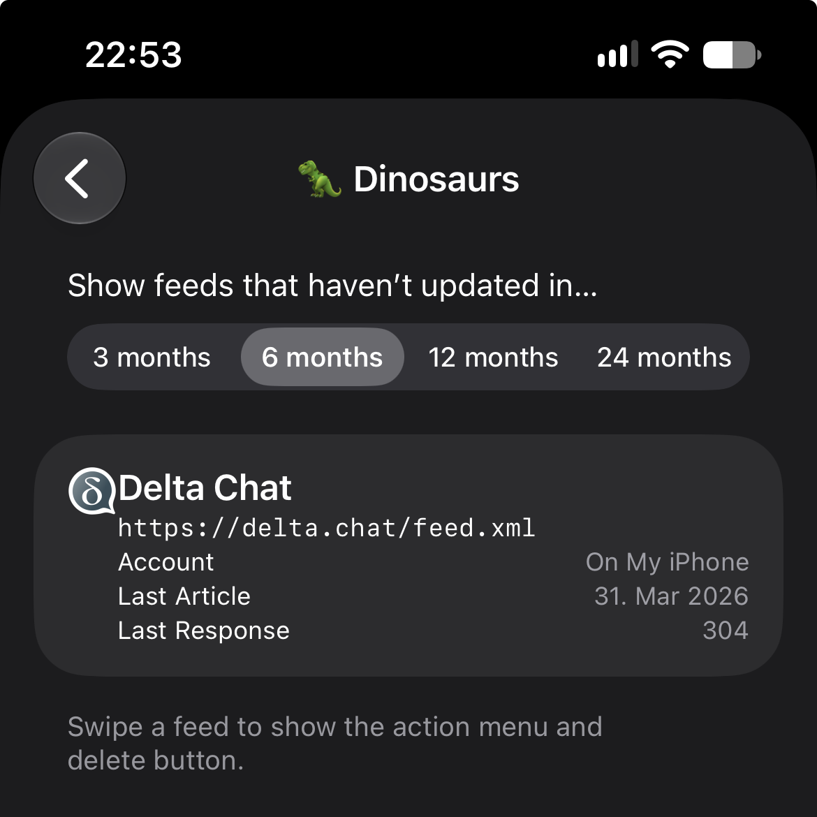
I’ve noticed that an icon for a feed in the dinosaurs screen is positioned very close to its name. In my view, it would look better if there were a bit more spacing—similar to how it appears in the screenshot within the help section.
This is what it looks like for me:
It did have more spacing originally, but something in iOS 27 messed up the spacing. Sigh.
(The iOS screenshot in the Dinosaurs page shows how it was originally https://netnewswire.com/help/dinosaurs.html)
At any rate — it’s on the to-do list to deal with this.