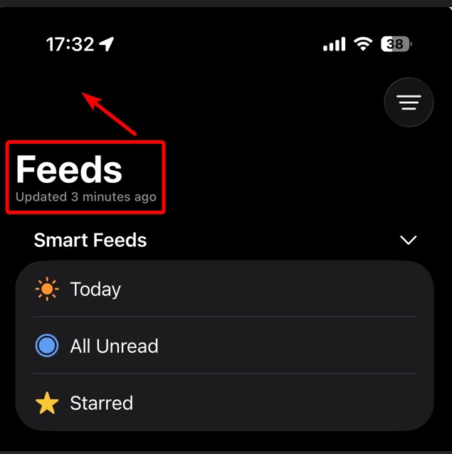
Can this be moved to be in the same line as the Filter button? Seems like wasted space.
1 Like
I agree with that suggestion. It’s fit with new design language of Apple native apps like podcasts and music
When you scroll, it does go up. It’s one of the behaviors Apple has been pushing for a while. (Works the same way in Mail, Notes, etc.)
There’s nothing wrong with it! It’s just a small tweak. Since it doesn’t include a back button, many Apple apps move the main title to the top to save space, similar to how Apple Photo, Apple Podcasts, Music, or the App Store handles tabs top bar large title placement. So, it’s just a UI adjustment.
1 Like
To be fair, Apple’s UI has little consistency.
Files, Contacts, Phone, Notes, FaceTime, Clock, Settings, Messages, and TestFlight don’t use left-aligned large titles.
As of now there’s 2 diff styles or UIs, sometimes when I open the App I see this until I scroll.
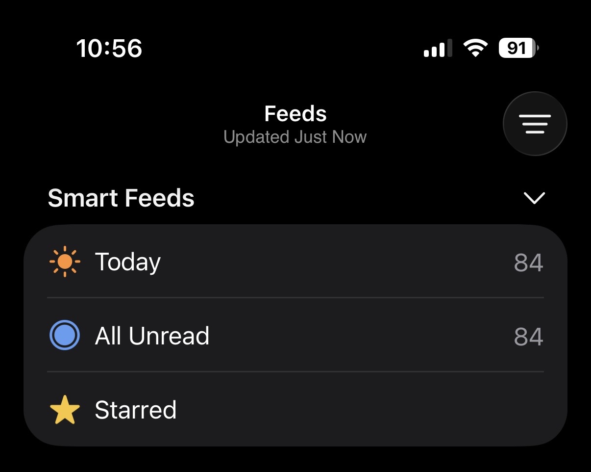
Other times I see the other (big title), but when you scroll the big title stays on, scrolling up shows the small one for a bit and it goes away. I don’t know why there’s 2 styles, I prefer the big one, it’s easier to read.
As for placement, it seems both ways would follow Apple’s guidelines or style, but since there’s nothing else up there, why not just move the Title up? that way there’s less scrolling if you have a lot of feeds below.
1 Like