The widget looks a bit misaligned headlines feel cramped and the spacing seems uneven.
Would you elaborate? Cramped vertically or horizontally? Misaligned how? Thanks!
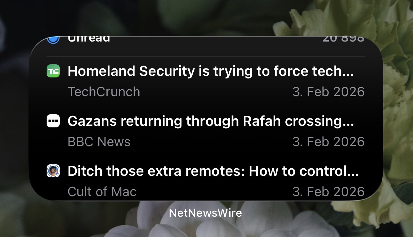
As you can see, the top widget title “Unread” is quite stretched, and the number of unread articles is partially hidden. This issue is even present on the iPadOS. I’m using the beta version, and I can confirm that the App Store version doesn’t have this problem.
Ah! I had assumed you had scrolled. Got it.
Added to bug tracker: https://github.com/Ranchero-Software/NetNewsWire/issues/5084
1 Like