Hi everyone,
I’m a big RSS fan and I’d love to share some thoughts on how the app’s look & feel could be improved from my perspective.
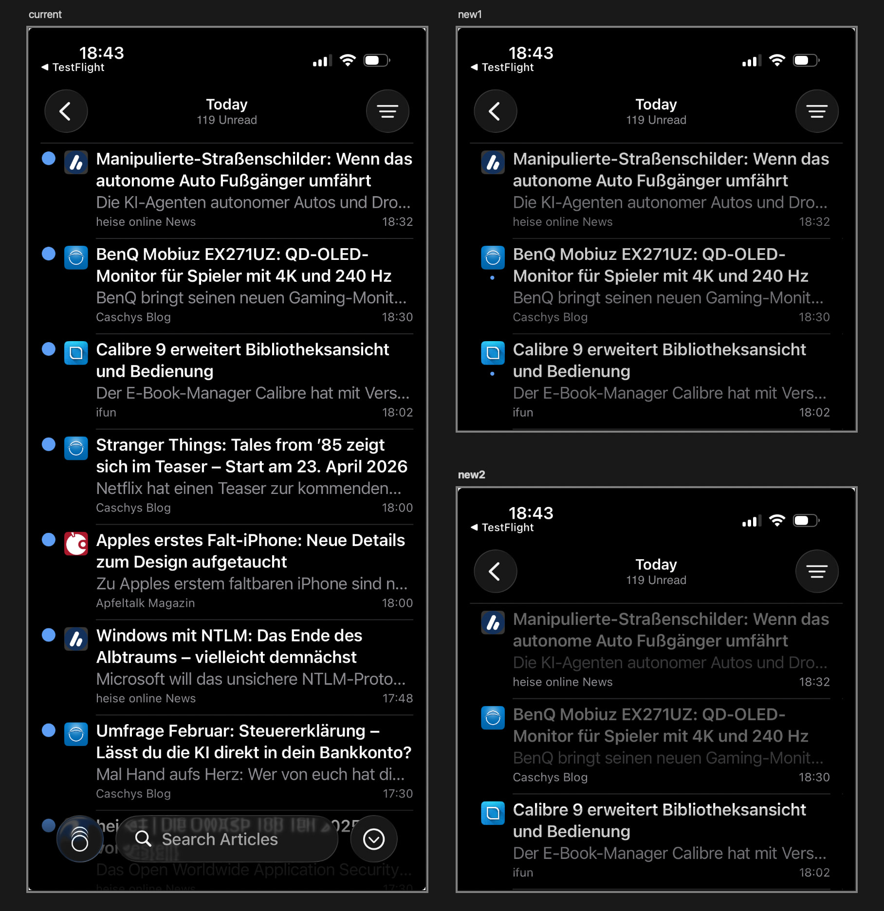
I’ve attached an image for reference: on the left you’ll see the current timeline design, and on the right two alternative proposals.
Below is a brief explanation of what I changed.
Changes shared by both versions (New1 & New2)
-
I feel the large blue circles on the left side of the timeline are quite dominant and take up a lot of space. I wanted to reposition or rethink them to rebalance their importance and the overall visual hierarchy of the timeline.
-
The white headline text feels very bright to me. Slightly darkening it could make the interface easier on the eyes, especially in dark mode.
Individual versions
New1
In this version, I moved the blue circles below the website icons. This gives the design more breathing room and makes it feel calmer and more efficient in terms of space usage. The blue circles no longer compete with the favicons in terms of visual hierarchy, but for users who like the dots, they’re still there.
New2
This version is my personal favorite. Here, I removed the blue dots entirely to create a more minimalist feed. Read vs. unread articles are no longer indicated by a blue dot, but instead through dimmed vs. non-dimmed preview text. This makes it immediately clear at a glance which items have already been read.
This is just a small piece of feedback from someone who really enjoys RSS reader apps. I don’t want to step on anyone’s toes, if feedback in this direction isn’t helpful or desired, please feel free to ignore it. If it is useful, I’m a designer and would be happy to offer more support around design and overall look & feel.
Best
Q