As a new user I don’t want to barge in and demand new features. On the other hand, this is a unique time in that I look at the app with a fresh pair of eyes. I don’t really have any complaints, but some suggestions for the article list.
- I miss easier access to the share sheet from the article list
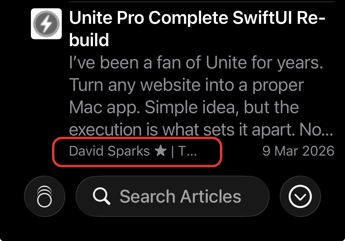
- on the smaller iPhone screens I feel the icons take up too much space for what they are. Perhaps the content preview (the number of lines from the article you choose to show) can tuck in underneath the icon to maximize the space?
- I would like the name of the feed to be visually a bit more prominent in the article list. The name of the author is important in gauging if I want to read or save the article (see below)
I’m happy to add these points to your feature request list in Github, but as I said I’m loath to add unnecessary noise. Do you think I should add these feature requests there?